Saturday, June 27, 2009

Misunderinvestment: 1Q 2009

Aye-yie-yie. 4.5% of GDP has disappeared from the most important part since 1Q 2006.

The biggest declines were in single-family homes, transportation equipment (this does not include personal transportation), other residences and home improvements, and computers and software. The two bubbles - dot.com (blue) and housing (orange) - can be seen plainly.

What is most disturbing about this decline is that the US already had among the lowest rate of investment in industrialized countries - only Germany was lower. (I'm still puzzled by that, though it could be a data issue.) Investment and growth go hand-in-hand. But what sector needs more investment? None that I can see, at least until obsolescence and population growth catch up to current supply - which will take 3-5 years. However, if the dollar finally falls to where it should be, construction of manufacturing structures and investment in industrial equipment will go much higher than recent levels.

Update: Here's the investment data in context. I've marked the recessions with a black line near the bottom.

Open Letter: Congressional Pay

Dear Senators and Representatives,

I am writing today about the ever-contentious issue of Congressional pay. I am tired of hearing about the issue every year or so, and even more tired the political theatrics that accompany each vote. I have a very simple solution: tie the pay of various federal officials to the federal minimum wage.

Tying pay to the minimum wage would have benefits beyond getting rid of silly political posturing. First, it would help people remember exactly how much the current minimum wage is set at. Many federal elected officials (but not the Vermont delegation, of course) would benefit from being reminded on a regular basis. Second, it would help illustrate how excessive the pay packages of executives and financial types have been over the past decade. Even at a salary set at 40 times the minimum wage, the president would be vastly underpaid compared to executives at major corporations, who are often paid 500 or 1000 times the minimum wage – whether or not their companies are profitable.

Below is my proposed pay schedule. The new salaries would give considerable raises to many federal officials because I believe they are currently underpaid relative to the importance of their responsibilities. Higher pay would also reduce the need or incentive for senior officials to become lobbyists after leaving government. Slowing the speed of the revolving door would save taxpayers billions in the long run because former government officials are very good at lobbying for unnecessary spending items, as well as much more costly tax breaks.

  • President – 40 times minimum wage of $7.25 per hour – $603,000
  • Vice-President, Supreme Court Justices – 30 times – $452,500
  • Senators, Cabinet Secretaries – 25 times – $377,000
  • Representatives, Appeals judges – 20 times – $301,600
  • Under-secretaries, District judges – 15 times – $226,200
  • Etc.

Obviously, enacting these changes is low priority right now, but they would probably take a couple of cycles to pass even in good economic times. Nonetheless, I would like the Vermont delegation to begin drafting the legislation so it can be put forward sometime next year.

Thank you for your time.

Open Letter: The Public Option

Dear Senators and Representatives,

I am writing today about the very important issue of health care reform. It appears that something will be passed in Congress this year, but of course the details are critical. Specifically, a bill without a “public option” is unacceptable. Without that provision, the impact of any reform bill would be negligible. You must speak forcefully for the public option.

However, having a public option is just an interim step. The United States must ultimately move to a universal national health insurance system. That is why I am disappointed that you did not co-sponsor S.703 or it's House equivalent, H.676. Though each bill is flawed (S.703 has too many details about health care delivery, while H.676 is essentially a placeholder with not enough details) it is important that you endorse and advocate the ultimate goal of the bills. If you do not understand why you should, please review the following economic issues:

  • A free market in health insurance is unworkable because only healthy people are profitable to insure. This fact is completely incompatible with the goal of universal coverage, or even broad coverage. By the time insurers are regulated so that coverage cannot be denied on the basis of race, age, gender, geography, existing conditions, and family history, there would be no purpose in having the insurance companies in the mix. They would merely be providing expensive claims processing.
  • The very business model of health insurance creates huge, wasteful bureaucracies in doctors offices' and the insurance companies due to the endless fight over the payment of claims.
  • Tying health insurance to employment adds a major overhead cost for employers, while disadvantaging small companies and entrepreneurs relative to large companies which can afford employees dedicated to negotiating lower rates.
  • Healthy workers are more productive and take fewer days off (for real illnesses, at least).
  • Private insurers have no incentive to invest in preventative care, and preventative care is much cheaper (in the aggregate) than curative care. Up-front investment in good maternity care also yields high returns.
  • Emergency room care delivery (where the uninsured cannot be turned away) is substantially more expensive than care provided in a medical office or clinic.
  • Government-run health insurance systems in other countries have proven records of costing less while covering more people and producing better results as compared to the U.S arrangement.

Many Senators and Representatives need to be reminded that the benefits of a national health insurance system for their constituents far outweigh any harm their campaign contributors in the insurance industry claim will happen. Please remind them often, and help the nation take the first step towards the ultimate goal by voting for a reform bill with a public option.

Thank you for your time.

Thursday, June 25, 2009

Suspiciously Conspiracy-Like

(This is an old post that never really developed. I might list the overlapping members some day.)

Generally I don't give much credence to conspiracy theories, mostly because they require far more competency than any group of humans could possibly achieve. Still, sometimes things really do look a bit fishy.

Consider this list.

Now consider this list.

And this list

And this list.

And, finally, this list.

I don't think there is some secret conspiracy going on here; the omnipresence of well known names is quite visible, if not exactly posted on a billboard next to I-95. But the small size of the leadership class is part of the reason that policy so rarely works in the public interest.

Wednesday, June 24, 2009

There Goes the Development: May 2009

Today, for my edification and perhaps somebody else's, I've produced this graph of single-family home sales (ignore the incorrect labels).

Again I've plotted the data as sales per 1,000 population. Unlike the starts data (which is for all units) the trend is up - though the bubble probably made the slope steeper. I don't know what has caused the uptrend, so I'll speculate: this data shows sales, and the increase reflects people buying more spec homes and ordering less custom homes. Sounds plausible. I'll try to figure out what is really going on next month.

Another thing to note is that while the YoY declines have only briefly exceeded 50%, the decline from the peak is currently at 76%. That is a stunning number.

Tuesday, June 23, 2009

Timing Your Start

Here's today's effort at being Captain Obvious

Yep, I blew it there.

Update: Not so bad here. Not liking that volume explosion, however.

Blah.

Monday, June 22, 2009

Marriage by Fiat

The deal for Fiat to partner with Chrysler is done. I think that everybody - Fiat, Chrysler employees, the UAW VEBA, the USG, the remaining dealers, and even the whiny creditors - got more with this agreement than they would have if Chrysler had been liquidated. The biggest losers are whoever had planned to cherry-pick things like the Jeep brand or the minivan franchise or various other bits of IP out of the wreckage.

What I haven't seen published is a side by side comparison of Fiat and Chrysler. A lot of people have said it is a good match, and a quick glance at the product portfolio suggests they are right. But shouldn't we do more thank kick the tires? (Sorry, couldn't resist.)

Here's a rough comparison of the companies. While the automotive divisions are about the same size, FIAT as a whole is a much larger conglomerate. So even though it contributed to no cash to this deal, Fiat should be able to bring a lot of resources when needed in the future.

At first glance the car lineups of the two companies don't overlap much, which is good. But closer inspection reveals a major hole in the D-car segment. The Sebring/Avenger sedans are awful, the Croma is a wagon-like thingy that doesn't sell very well, and while the 159 is nice, the platform is probably too costly to adapt to lower market segments. The Croma has the added problem of being based on the GM Epsilon platform, which underpins the Malibu and a bunch of other GM vehicles. I assume the Fiat has the rights to the IP, but the question remains as to whether it can successfully improve this platform as much as it's larger rivals are sure to. This hole is a big problem because in the US the mid-size segment is the best selling among cars.

There are additional problems. For instance, Fiat's C-segment cars are all hatchbacks, which aren't very popular in the US compared to sedans. Most companies have multiple body styles in that segment (3 and 5 door hatchbacks, sedan, wagon, coupe), even if they aren't all sold in the US. Fiat's B-segment cars are also all hatchbacks, but body dimensions in this class make any other shape of low utility. Another problem is the lack of smaller sports cars. The Sebring convertible still exists for now, and sells great to rental fleets and middle-aged women. But currently Fiat has nothing to compete with vehicles like the Miata or Solstice/Sky. Chrysler's E-segment cars are about to be refreshed, and the platform could be used by Alfa to fill the hole in that part of it's lineup. But they are heavy and thirsty, and thus could suffer from another gas price spike. On the other side, the Thesis is an oddball I can't find much information about, and the Quattroporte is both tremendous and tremendously expensive.

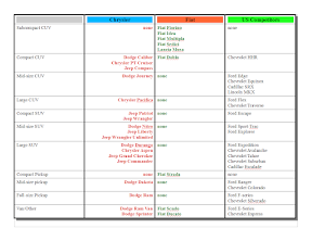
In the so-called "light truck" arena the combination looks good at first as well. (I should note that the line between CUV and SUV has become rather blurred, and some of the categorizations I've made are debatable. Also, I put minivans on the cars page for space reasons.) Fiat has a very odd mix of vehicles piled up at the small end of the CUV market. I don't think any of those would sell much in the USA. Unfortunately, the Caliber/Compass twins aren't all that good either. The Journey is a little better, and potentially could be re-used in Europe. Of the more pure SUVs, most of the models just aren't suitable to either European tastes or European roads. This includes the Pacifica (which has been scheduled for cancellation anyway), the Durango/Aspen pair, the Nitro/Liberty pair, and the Commander (also scheduled for cancellation). The Wrangler and the Grand Cherokee do have potential to sell in Europe and elsewhere. The pickups don't. Fiat already has a number of commercial vehicles, so the Mercedes-derived Sprinter and old-school Ram Van are likely to die soon.

That leaves the iconic (but scheduled for cancellation) PT Cruiser, and the mini-vans, where the sizes are close but not quite the same. The Ulysse/Phedra pair are about the size of the Chrysler minivans from two product cycles back. The Grand Caravan/T&C pair still sell well, but the market isn't as popular these days. Honda, Hyundai/Kia, and Toyota have taken market share (as well as driven Ford and GM out of the category) Here the combined companies would be best served to continue to the Chrysler platform as-is, but slightly downsize the Fiat platform. The PT Cruiser is very dated, but still sells. I think the plan is to build the US-market 500 in Toluca plant, so there is no chance of the PTC continuing.

So, to summarize, the overlap is minimal both in terms of existing product and sales areas. However, there are major product holes that need to be filled very soon. I still have doubts as to whether Chrysler can survive long enough to get the small Fiat models in the showroom and selling well. I also have doubts as to whether the combined company can make a competitive mass-market D-segment car because it has been a chronic problem for both companies. Arguably Fiat has never had a good car in this class, and while the original "cloud cars" were competitive when they were first brought out, that was over 15 years ago now. Chrysler - under Mercedes' lousy management - let the original platform fester, and then was forced to work with a half-baked platform donated by Mitsubishi before Mercedes gave up its ownership in the Japanese firm.

It will take several months to see how the new combination is working. The extended shutdown at Chrysler has cleared a lot of inventory which should help the remaining dealers. But the car market is still much smaller than it was a year or two ago, so it might be that the remaining Chrysler plants can't be run profitably.

Saturday, June 20, 2009

Inspecting Clunkers

A so-called "cash for clunkers" program was appended to a military spending bill and passed by Congress on Thursday. It really is a pretty lame program from an fuel economy point of view, as is demonstrated here as part of a larger rant. Of course, fuel economy wasn't the primary driver of the program - increasing car sales was. And like most poorly thought out government programs, there are plenty of unintended consequences.

Could a good trade-in program be designed? Probably. I've been noodling on one but the futility of it all is overwhelming me right now. Maybe I'll haul my plan out some other day.

Weran Amok

(I try to keep politics out of this blog for a number of reasons, but nonetheless....)

I wish the people of Iran the best. I really do. Some observations.

  • Right now nobody outside of the Iranian government really knows what happened with the vote.
  • The election procedures as I understand them from the reports definitely look fishy.
  • The Iranian protesters don't seem to want radical change; they want an explanation of what happened in this election.
  • The protesters appear to acted overwhelmingly (if not completely - though any exceptions could be government provocateurs) in a calm and dignified manner.
  • The reactions of the government look desperate and are completely ham-handed.
  • Mousavi has a less than stellar record.
  • The president in the Iranian system isn't as important as some people seem to think.
  • Contrary to the opinion held in some quarters, Iran and the Iranian people aren't our enemies. Iranians had a legitimate complaint about the U.S. government in the late 1970s, and then again in the 1980s. Since then it has served the purposes of both American and Iranian politicians to continue the verbal sparing.
  • We are fighting two wars in countries that happen to border Iran, so we cannot afford to significantly antagonize either side.
  • Obama is right to say the foreign policy of Mousavi and Ahmadinejad would not be that much different (though tone does matter).
  • Obama has played this right and Congress - most notably McCain - has not.
  • We should butt out because we have enough problems to fix already.
  • The demographics say that even if Ahmadinejad wins this time the next election will bring significant change.

Update 2009/06/29: Well, our ADD press has moved on from Iran to newer coups and the deaths of various celebrities. I'm pretty sure we in the U.S. won't know what really happened in the election for years. Regardless, the existing regime survived, and I think that is bad both for Iranians and the US. Tone matters, and Ahmadinejad has used the US as a foil for years. Obama won't take respond in kind for now, but he has set a semi-firm deadline at the beginning of next year for "action" on Iran's alleged nuclear program. The old pattern of unnecessary antagonism is likely to resume then.

Thursday, June 18, 2009

Doing It in the Road: April 2009

This data set doesn't tell me too much.

Vehicle miles per vehicle has been roughtly flat for a decade. The data for vehicle registrations is annual so we won't see any change in 2008 for a while. My guess is that VMT per vehicle will go up in the next few years as the fleet size declines and family/household members share fewer cars.

As far as VMT per capita goes, I think it is a slightly trailing indicator of economic activity. That the rate of decline appears to have stopped increasing is good news less bad news for the economy. I'll try to compare VMT to petroleum use in the next few days.

Pattern Recognition

Humans brain are frequently overly aggressive when searching for patterns.

Is there a tradable pattern here? The long-term and recent average says yes; the 1998-2003 average says no.

Update: I took 2007 and 2008 out of the long-term average because prices were so much higher in nominal terms than any other year. This flatted the long-term line and shifted the peak into the fall. I also added the following graphs.

Looking at the average can be deceiving.

This graph shows that some of the price increase is due to weakening of the dollar. Note that WTI Spot is not the price paid in these foreign countries due to variations in grade, contracts, origin, etc.

Wednesday, June 17, 2009

Divergence

Some graphs of ETFs and related indexes.

TBT is supposed to perform 2x inverse of TLT (for which I have inverted the data). However, it clearly doesn't. Neither track the rate indexes well. (NB: The rate indexes may be inappropriate, but I used them because I don't know of a price index to use.)

USO is supposed to follow WTI spot (after expenses and fees). Again, there's a big gap. But despite a lot of griping about USO across the tubes, it is performing better than the other ETFs I examined.

A follow-on question would be how are similar MUFs performing in comparison.

Tuesday, June 16, 2009

Starts at Home: May 2009

Are we at the bottom for housing starts?

Possibly. This graph shows the starts verses population expressed as annual rates (so, 307M people times 1.73 starts per 1,000 equals 531k starts). The numbers are at record lows and well below trend. But there are a lot of factors, such as household formation rates, amount and location of available inventory, and credit availability that I haven't looked at, so I can't really say for sure. But the bottom has to be close, barring another big leg down in the overall economy. However, even if it is close, that doesn't mean the rebound will be robust. Increases are likely to come at a slower rate than after the last bottom in December 1990.

Monday, June 15, 2009

Overly Full Disclosure: June 2009

I'm finally out of my TBT. I got in too early, and my record says that I'm probably out too early - though I missed the high last Thursday before it got hammered for reasons I have not yet discovered. But 10% was still good enough for me. A lot of people say this is not a good ETF to hold more than a few days or weeks. I get the jist of the argument but I haven't quite gotten my head entirely around the details. The decay is one of the reasons I got out, plus there seems to be a general reversal of sentiment taking place.

I took a small position on USO a few weeks ago and exited that on Friday. There is a lot of speculation about speculation and front-running and tankers and yellow shoots, so I don't think it can go much higher. I made about 5% in two weeks.

I also had an even smaller position on UNG that I exited today. I made about 5% in 5 weeks. UNG has a better chance of going higher than USO, but weather, supply, and the change in sentiment point the other way.

Of course, I could kick myself for what I missed back in late November. Stocks I had on my candidates list as of 11/16, such as JWN and M and BHP, are up over 150% since then since then. Even CAT and TM and INTC are up nicely. But I paid too much attention to the doomers, and thought things could get a lot worse. Instead, I should have looked at what my spreadsheet was telling me - buy, Buy, BUY! Oh, well.

Update: My trade accounted for 0.0000074% of today's NYSE volume. Spiffy.

Disclaimer: you're an idiot if you invest based on anything I say.

Sunday, June 14, 2009

Unequal Exchange: April 2009 Edition

The rest of the world is still taking our little bits of green paper in exchange for their stuff, but we are asking for a lot less stuff these days.

While the year-over-year numbers are still brutal, the absolute trade deficit figures have gone the wrong way recently. I haven't imported the monthly details so I'm not sure why, and eyeballing the numbers doesn't reveal big changes in any category.

Saturday, June 13, 2009

Drop 'til You Shop: April 2009 Edition

The drop in retail sales actually stopped a few months back, but the levels remain low.

Entirely unsurprising is the news that autos and auto parts have fallen the most in percentage terms. They will spring back some, adding $5B or $10B back to the total. This would put total retail sales at about $350B per month, down about $25B from the peak, which adds up to an annual decline of $300B.

So where could the other $700B of the $1T reduction in consumption come from? Either from a further decline in retail sales, or a fall in consumption of services.

Thursday, June 11, 2009

Worthy Fellows: 1Q 2009 Edition

There was much wailing and gnashing of teeth in Blogistan today once the latest Flow of Funds report revealed that overall debt still going up. Well, we expected that given how much the government is borrowing. Duh.

The line we need to watch for a few years is the solid red line, which shows liabilities. And it went down slightly last quarter. But remember this data is not adjusted for inflation (because I'm too lazy to dig out the GDP deflator and apply it to the data) so liabilities actually are down slightly more than the slightly indicated on the graph.

So, again, the question is what do we want the household debt level to be? 50% of GDP? 25%? 66.67%? Pie? Let's say 50%, which is the long-term average. It's currently at 100%, or $14.1 trillion. So, to get it down to 50% in 10 years means a rate of reduction at 5% per year (I'm leaving out compounding and inflation - laziness again). That yields - ta da! - $700 billion again. Unfortunately, the $700B derived a few posts back was just the total for consumer credit. So the other $6.3T would have to come out of mortgages. The current total for outstanding mortgages is $10.4T. The total was last at $4.1T in1Q 1999. For reference, in 1Q 1999 the total value of household real estate was $9.8T. Now it's $17.8T, down from $21.8T in 1Q 2007. If the 1Q 1999 value had grown at about the rate of inflation, or 4%, the current value of household real estate would be about $14.5T. But since home prices were already a bit high in 1999, extrapolating the 1995 number results in a value of 13.3T.

Where am I going with all this? Nowhere, really. It's just something ponder.

Extraordinary Claims: June 2009 Edition

Here's the latest UE claims data. I believe the data can be used as an early indicator of employment trends, but I need to look at what the precise correlations are.

Still pretty high.

Claims still haven't reached previous highs relative to the population. We've probably seen the peak rate, but like the last two recessions the falloff will be slow.

Tuesday, June 9, 2009

What's in the Bag: June 2009 Edition

It would be nice to know what's in the bag because ultimately we, the taxpayer, are holding it.

The Fed's liabilities remain fairly understandable. They consist of currency (which can't be redeemed), deposits from the Treasury, and excess reserves on deposit from commercial banks.

This shows better how much non-traditional liabilities have grown.

This side of the balance sheet remains as clear as mud. Who issued the commercial paper? What collateral did banks bring to the anonymous replacement for the discount window (the TAF)? What garbage was transferred from Lehman to the Maiden Lane LLCs? What's backing the AIG credit line? What countries are on the other end of the foreign currency swaps (the "Other" line)?

The big green blob at the bottom is headed back towards its previous share. That's gotta be good, right? Well, "Securities" now includes not just Treasury Bonds and Notes and TIPS (not so many of these), but also "Federal agency debt" and "Mortgage-backed securities". Yeesh.

I actually think it's unlikely that the Fed has taken on a dangerous amount of risk. And if we get to a point where the Fed is taking big losses on its books, well, the issue would be moot because the economy would have completely imploded. But I don't know if I'm right or wrong. I certainly would like to know.

Update: The Fed's Inspector General is either really bad liar or a total idiot. What an embarrassing performance.

Update the second: Somebody (I gotta start saving this stuff) made the argument that the TARP money being repaid today shouldn't be accepted unless the banks have weaned themselves from all other support programs. The Fed's balance sheet probably is one such program. But, of course, we don't know that.

Update: Results - I get them.

Updatier update: I had forgotten that the Fed is paying interest on those excess reserves. The banksters aren't going to be making withdrawals anytime soon.

Monday, June 8, 2009

Inflated Expectations: April 2009 Edition

The great inflation/deflation debate rages on. I continue to have things both ways by expecting deflation in the near term and inflation in the long term. However, the exact start and end dates of those time periods continue elude me.

M1 through MZM are up far more than the GDP growth rate - which is not hard when GDP is shrinking. So why aren't we carrying around our lunch money in wheelbarrows? Well, all that new money isn't doing anything. At least that is what the M1 Multiplier is supposed to tell us. Banks are hoarding cash, so much so that they are holding more on reserve at the Fed than people are putting into their checking accounts. And people are putting more in than they have at any time in the past decade.

So you say "whu-huh?!?" Let me explain a bit further. The numerator in this ratio is M1, which is currency plus demand deposits (checking, basically). The denominator is M0, which is currency plus commercial bank reserve deposits at the Fed. Normally, due to the magic of fractional reserve banking, every dollar the Fed pumps out in cash results in another $.60 or more of money appearing in various demand deposit accounts. But now, even though the Fed is still pumping out dollars, the fraidy-cats at the banks are stashing away even more at the Fed. A lot more (see the fifth graph down).

Zooming out a bit shows that, like so many other things happening lately, the change in the M1 Multiplier is unprecedented - at least in the data that Fed provides. I'll have to see if there is a wider set floating in the tubes somewhere. Also, there is a long-term downtrend, which probably reflects changes in how people manage their money.

But, you ask, what happens if the banksters snort a few lines of coke and decide to go on a loaning spree, and need their excess reserves back to fund their fun? I dunno. My guess is not much, because the excess reserves have been used by the Fed to buy stuff - mostly stuff of dubious value. So the process would be reversed - cash back in, stuff back out into the great and glorious markets, deposits redeemed, and voilà! no problem. Maybe. I really dunno. But it's something to ponder.

Update: Regarding inflation, I think the question is: what is the exact nature of the money that banks have deposited, and that the Fed has used to buy stuff? Is it currency, or is it just bank money making another stop on its way through the system. Normally, the required reserves that the banks keep on deposit are in cash. The requirement that they be in cash, and the limited amount of cash issued, act to restrict the amount of money that banks can lend out. Is the same true for the excess reserves?

Update: Scratch the previous update. I confused vault cash with reserves. So I am back to being uncertain about the inflationary effect of the excess reserves.

(PS: This is yet another post that might have to be completely redone if I learn more.)

Saturday, June 6, 2009

What Goes Around: 1Q 2009 Edition

There has been a lot of talk scattered across the tubes about consumers "deleveraging" as in actually reducing the amount of debt they owe. (Deleveraging is not really the appropriate term for consumers because they don't "lever up" as financial companies do in an attempt to control assets far in excess of what their own capital could achieve. But I digress.) The Flow of Funds Report (Z.1) showed that consumers had stopped accumulating new mortgage debt, but that consumer debt was still increasing. A more current data set (G.19) shows that accumulation of consumer debt has stopped. (Note that this data set is in nominal dollars so the YoY numbers are NOT adjusted for inflation.)

Revolving credit (mostly credit cards) is actually being paid down in both nominal and real terms. Non-revolving credit (mostly car loans) is still increasing slightly in nominal terms and is probably decreasing in real terms.

I'm less familiar with this data set as of now, so I don't know how far consumer debt "should" be paid down. Eyeballing the chart suggests that debt levels of 10% of GDP for non-revolving credit and 5% for revolving credit might be good targets. But since revolving credit is usually very-high interest credit card debt, that target should probably be lower. If the targets were 10% and 3% of GDP, that would mean consumer credit would fall by 5% of GDP, or $700B. That translates to about 7% of 2008 consumption - which is not to say the debt would all be paid off in one year. But even spread over 4 years the hit to the economy would be huge. Unfortunately, it has to happen at some point.

Friday, June 5, 2009

How's That Working For You: May 2009 Edition

Positive second derivatives are breaking out all over the place. Too bad they can't be used to pay the rent.

Nothing good here. The labor force - the most dubious statistic the BLS publishes, in my opinion - increased, but at a rate below population growth. This means the unemployment number is worse than it appears.

E2P and E2CNIP continue to drift down. As I showed back here America's E2P ratio in 2007 was close to the median for other industrialized countries. Even after the current fall the ratio would would still be above the previous figures for France, Italy, and Belgium. But those countries have different safety nets and social arrangements so I am not confident that the decline in America can be sustained without substantial changes - and in what, I don't know.

Thursday, June 4, 2009

A Long Way to Go

Have far have we gone on the road to re-balancing the economy? Not far at all.

We're still consuming far above the 1946 to 1996 average. (I chose not to include data after 1996 because 1997 is when it all started to go really wrong - though it doesn't show up in the data until 1998.) We're also consuming more than our equally bankrupt friends in the U.K., and far more than our sober peers in CA, JP, and the Eurozone (on average - the numbers vary widely within the zone).

I suppose I've become a bit of a crank on this (at least in the privacy of my own home), but it can't be stressed enough how painful the transition to a sustainable economy will be. Americans are not mentally prepared for what is to come.

Worthy Fellows: 2008 Edition

One final graphy post for today. The set contains some slightly encouraging news about debt, but very discouraging news about assets.

Assets are evaporating but debt isn't, as expected.

We can safely say we've never seen wealth destruction like this before.

Real estate is actually increasing its share of Americans' net worth.

That is because financial assets are more volatile than real estate.

I forget what "other" liabilities are, and I'm too tired to look it up right now.

In nominal terms mortgage debt has stopped increasing. That means it is falling in real terms, albeit slowly because inflation is near zero.

Wednesday, June 3, 2009

GDP Data for 2008

Another belated post full of graphy goodness.

No dramatic changes at the highest level. The trade deficit fell slightly, but the country is still over-consuming.

Even with the trade deficit falling, both exports and imports increased as a percentage of GDP.

Consumption of motor vehicles registered the greatest decline. The share of spending on cars and parts (but not transportation services or fuel) has fallen from 4.1% of GDP in 2002 to 2.7% in 2008.

Residential investment has fallen from a peak of 6.1% in 2005 to 3.4% in 2008. That's a huge change. The increase in non-residential structure investment over the same period made up for half of the fall in residential. But the sector is wildly over-supplied and thus spending is set to contract.

Slavery for the Free: 2008 Edition

I'm a wee bit behind in posting this, but nonetheless here is the latest debt data.

Debt accumulation marched on, at least through December of last year.

Taking out intergovernmental debt doesn't change the overall picture.

Hooray! Consumers almost stopped accumulating debt last year. Too bad it took a major recession to force the change.

Here we see the spike in publicly-held federal debt that started last year. This year's increase will dwarf all previous years.

Under the Hood: May 2009 Edition

Positive second derivative! Ok, I didn't check that, but at least for Ford and GM the rate of decline seems to be lessening. Toyota, however, got hammered again.

The bottom has definitely been found.

Lincoln wins the least bad brand performance title this month by actually increasing sales. Izuzu seems to have finally worked off its US inventory.

Subaru remains at the top here.

New graph! Entirely unsurprising contents! (Except July 2005 - what happened there? Was that an employee pricing month?)

Another new graph. This one doesn't tell me much.