Saturday, January 31, 2009

Industry, Perseverance, and Frugality Make Fortune Yield

Apropos of the post prior to the previous post, here are some very simple revenue projections for taxes other than the personal income tax.

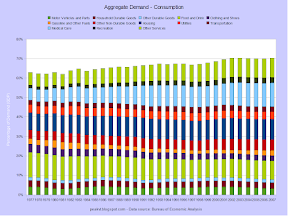
Since it is assessed at a flat rate, a value-added tax is regressive. Poorer people, who spend a greater amount of their income, end up paying more tax as a percentage of their income than the well-off do with a VAT, or with any other consumption tax for that matter. This can be somewhat mitigated by excluding certain items. Food and housing are the most common. If consumption stays at 70% of GDP, a 12% VAT excluding food and housing would yield just about 6% of GDP. If consumption falls to 58% the rate would have to go to 15%. For comparison, the median rate in the EU is 20%.

Ah, the gas tax. One would think after two wars directly related to oil (yep, they were) people would be gung-ho about this source of revenue. The current federal gas tax is $0.184 per gallon, with an additional $0.00 (Alaska) to $0.416 (New York) in state taxes. Taxes on diesel are slightly higher. Increasing the federal tax to $1.50 would yield about 1.5% of GDP at the current consumption rate of 9.5M barrels per day. The total pump price would go up to about $4.00 per gallon.

This is an attempt to look at a carbon tax in a slightly more sophisticated way - but I don't have a background in economics so this initial cut could be completely wrong. Anyway, there are three sets of lines - no reduction, a 2% decrease for each $5 per ton increase in the tax, and a 4% decrease. Applying the 2% factor resulted in consumption falling by 45% at the highest price, and the 4% factor resulted in a reduction of 70%. Nice results, but they in no-way reflect what might happen if a big tax was slapped on tomorrow - pure chaos. But applied over time - increasing by $5 per year, and by $10 after several years - there would be significant reductions without harm to the economy, though the change in consumption would not follow a simple curve.

For reference, the Iraq War has cost about $600B so far, and the total long term cost will be much higher. If we had tried to pay for the war in real-time, a gas tax of $1.00 or $1.25 would have covered it.

There Is Nothing More Imprudent Than Excessive Prudence

Apropos of the previous post, here are some graphs on federal personal income tax collections.

The difference between effective rates for 2001 and 2006 is pretty big. Not surprisingly, taxes collected as a percentage of GDP fell from 9.58% to 7.77%. That's good news for current taxpayers, but not so much for future taxpayers. On the plus side, the odd hump at the low end was cut down, though not completely eliminated.

In the second scenario in the previous post, I made the personal income tax be the major source of new revenue for a national healthcare system. Using 2006 AGI data, I projected what the possible yield might be for a certain set of effective tax rates. To get to around 14% of GDP, top effective rates had to be over 50%. Nominal marginal rates would be higher, potentially much higher if loopholes remain plentiful. Using somewhat more progressive rates than the 2001 figures, along with closing some loopholes at the top end, yielded about 9.5%. The top nominal rate for that year was 39.1% for taxable income above $297K.

Despite being as progressive as nearly anyone, I'm not comfortable with marginal rates higher than 40% (39.5%, actually). Why? I don't really know why; I assume it's because I've absorbed a small amount of the anti-tax rhetoric that is always floating about. On the other hand, I am very, very comfortable with pushing effective rates as close to nominal rates as possible, especially at the high end. But keeping marginal rates lower than 40% means most new revenue would have to come from other sources - corporate income taxes, excise taxes, or a VAT.

Wednesday, January 28, 2009

My Problem Lies in Reconciling My Gross Habits With My Net Income

I've been trying to get a better handle on what the future economy might look like. So far I've only tackled the federal government portion. (Note that spending in this presentation is a measurement of flows, not contribution to final demand. Also, much of federal "spending" is actually programmatic transfers to the states, which in turn do the actual spending.)

This is roughly how federal government taxes and outlays broke down in 2007. On the tax side there are essentially two streams - taxes not dedicated to any program, and payroll taxes dedicated to senior assistance. Total tax revenue has not been enough to cover net current spending since 2001, thus the box on the right side showing the amount borrowed. Over on the spending side there are three big categories - general government (both discretionary and mandatory), Social Security, and Medicare. As we should all know by now, Social Security is running a surplus and the excess is being siphoned off to pay for the rest of government. Even with that surplus in hand, the federal government has been a net borrower since 2001. In contrast, the revenue for Medicare doesn't cover its total costs, and thus some general tax revenue is used to pay for what the payroll tax and premiums don't cover.

Anyone who says (net) taxes can be cut at this point is an idiot or a liar. Between the current budget deficit (1.2%), the "borrowing" from the Social Security Trust Fund (1.4%), and the inevitable increase in debt servicing to both the public and the SSTF we will see in the near future(>1.3%), there is a structural revenue shortfall of about 4% of GDP. Any new revenue for creating national healthcare system would be on top of the other increases. The proposal here would raise SS taxes slightly (0.3%), raise personal and corporate income taxes substantially (0.8%), return the estate tax to its pre-2000 levels (0.2%), implement a carbon and/or gas tax (1.5%) and create a whole new revenue stream for a healthcare system. I favor this approach on the merits, but I realize it won't fly - at least right now.

Here's an alternative that voters probably would not find to their liking. Convincing people trade a carbon tax for a payroll tax deduction probably wouldn't be too hard. But raising personal income taxes to 16% of GDP? Unlikely. Doable, but unlikely.

Saturday, January 24, 2009

More Agreement

The nationalization idea is picking up steam. Buiter follows up with another post in favor of nationalization (in Britain). Salmon expends considerable effort educating Drum on the issue, as does Waldman. Drum, however, still is a nervous nellie about the n-word (no, not that n-word) even though he knows the losses are huge.

Finally, those who are too lazy to read can listen to Chris Whalen talk about the issue.

Wednesday, January 21, 2009

Too Much of a Good Thing Can Be Taxing

While wandering through my bookmarks I ran across an interesting list of tax reforms. Despite the fact that the author is an expert on tax policy and I'm just some putz with a blog, I'm going to disagree with her a bit.

First up is a list of personal income tax reforms, with which I mostly agree.

  1. I've never understood why the tax code isn't just fixed. Instead, Congress wastes time and political capital on the AMT every few years - and rich people still have lower effective tax rates than the middle class. If the AMT must be kept, then it should set to start at the 95% percentile of taxpayers and be indexed for inflation.
  2. More progressivity would be good, but I think rates should stay under 50%. The Clinton-era income tax rates worked pretty well, and would work well again if loopholes are eliminated and all types of income are treated equally. The primary goal should be to push up effective tax rates.
  3. I agree the capital gains exemption for non-rollover sales of principle residences should be eliminated for people under 65. The basis of a non-rollover sale should be the original purchase price indexed to CPI + 2%. The percentage on top of CPI exists to allow owners to exclude a portion of any remodeling or improvements.
  4. The mortgage interest deduction should be eliminated entirely and the standard deduction raised.
  5. I disagree that all types of income should be subject to FICA taxes. Social Security will be solvent forever if the wage cap is just eliminated. Medicare taxes would no longer be applicable if the country moves to a national single-payer system.
  6. Yes, treat all income the same, and require full reporting of non-wage income
  7. Yes, restore the estate tax and fix the tax code to prevent avoidance.

Next up is a list of corporate income tax reforms. This where we have different outlooks. A while back I threw out the idea of bagging the corporate income tax and instituting a value-added tax. I've modified that view to adding a VAT on top of a much simplified corporate "income" tax at a lower (15-25%) rate. (I use the scare quotes around income because a CIT is really a corporate profits tax.) Therefor I think adjustments to the current system are moot, nor am I all that convinced they won't be circumvented by companies or undercut by successful lobbying in a few years time.

I originally saw several reasons for moving to a VAT. 1) The current corporate income tax is just a complete mess, with all kinds of loopholes, credits, allowances, and other such complications that make it very uneven in its distribution. Because of its complexity and the resulting opportunities to be gamed, it distorts the microeconomics of companies, incentivizing them to invest in accountants and lawyers instead of their product or service offerings. For the same reasons, the current CIT produces much less revenue than it did a few decades ago. 2) Cross-border transfer pricing is often abused and a VAT would capture most of that kind of legal evasion. 3) America needs to more-or-less permanently reduce its consumption and alter its balance of trade. A VAT would apply pressure towards both ends. 4) At some point a lot of tax revenue will have to be raised in order to pay off the debt and to pay for a national healthcare system, and a VAT is an efficient way to do it.

I still think those reasons are quite valid, but I've revived the corporate profits tax because it is necessary to capture revenue from companies operating in the US (and thus benefiting from its protection and requiring services from its government) before the profits are sent offshore, either to foreigners or Americans rich enough to make using a tax haven worthwhile. I'd also like to see "double taxation" addressed, even though the issue has been pushed for dishonest reasons. Upward redistribution is the true goal of activists on this issue, not fairness. But by including a voucher for taxes paid along with the dividends, people who file tax returns in America could claim credits for the taxes paid by the issuing corporations. This would eliminate "double taxation" for American citizens and residents, but not allow rich people to escape paying income taxes on their earnings.

An issue that is often raised during a discussion about a VAT (or any other consumption tax) is regressivity. A VAT is regressive, but raising that point alone without a discussion of about all the other taxes a resident of a country might pay (not to mention government services said resident might receive) is rather disingenuous. Which is to say, any increases regressivity can be offset without much difficulty.

Tuesday, January 20, 2009

Four Point Nine Trillion Dollars

01/20/2009      10,626,877,048,913.08
01/22/2001     - 5,728,195,796,181.57
-------------------------------------
                 4,898,681,252,731.51

Just one of Bush's legacies.

WIN

Good luck, Mr. President.

FAIL

Monday, January 19, 2009

Too Much Agreement Kills a Chat

It's nice to see some of the bigwigs coming around to a position I advocated months ago - and that was thoroughly debated in the comments at Calculated Risk by about September 21.

Hopefully the concept will filter through the bureaucracy to this Obama guy I keep hearing about.

Update: Note that nationalization, as used by everyone prominent that I have read, does not mean permanent state ownership of all banks. It means forcing all banks to revalue their assets according to certain accounting rules and then seizing any bank that is insolvent. A bank is insolvent when its balance sheet is unbalanced, not because it cannot meet current cashflow requirements. Only cranks in the comments are insisting on permanently nationalizing all banks, usually along with the Federal Reserve. Everyone else has enough sense to say that any government-controlled banks should be unloaded at the first opportune point in the business cycle. The country has been through this (on a much smaller scale) during the S&L crisis in the late 1980s, so clearly it can be done without endangering our capitalist economy.

Friday, January 16, 2009

A Willing Suspension of Disbelief

I've been slowly working my way through a textbook by a certain hack economist, and I was inspired to make these slides.

The basic idea is that in a hypothetical "free" market the supply and demand will find an equilibrium at a certain price. Movements in the "curves" will change the equilibrium price. Changes might be caused by increasing raw material costs, more efficient production methods, waxing and waning popularity, appearance or disappearance of competing producers, or other factors.

In reality the supply and demand curves are not linear, and there is always some kind of tax in the mix. Demand or supply is considered elastic if it is very sensitive to price changes. Inelastic supply or demand is the opposite.

This is a terribly simplistic model of the global oil market. Demand is inelastic at lower prices and elastic at higher prices. Supply is the opposite. There isn't one production cost for oil because there are many sources, each of which required different levels of investment to develop. Ghawar, the world's largest field, has extremely low production costs, meaning the Saudis can make money even at very low prices. Tupi, the new ultra deepwater find off the coast of Brazil, is still being analyzed for viability and may never be put into production. On the consumption side, there isn't one price to end users due to different contract lengths and different levels of taxation. Venezuela, a major producer, takes the rather stupid step of subsidizing gasoline prices, pushing up demand which reduces the amount available for export. Norway, another major producer, was the poorest Scandinavian country until oil was found in the North Sea. Given their history, Norwegians are very conservative with their oil use and oil revenues.

Here's the basic argument for the gas tax: current prices don't reflect true costs. Some of the costs are immediately related to the production of oil, such as spills, or its consumption, such as smog. Other costs have a less direct connection, such as 9/11 or the Iraq War, or won't be felt for a while, such as global warming or potential scarcity. Costs that are not reflected in the price of a good or service are called externalities, and oil use has a lot of them. Raising the gas tax would "price in" some of those externalities, even if the revenues didn't flow directly towards solving them.

It's a no-brainer to me and other people who care about the future.

Thursday, January 15, 2009

Extraordinary Claims: January 2009 Edition

(The original title of this post was "Extraordinary Claims Require Extraordinary Evidence.")

New unemployment claims were down from last week, but the data is so noisy that rolling averages have to be used.

The four week average of the raw numbers is still highly variable. The peaks are after Christmas and in early July. The year over year increase for both the unadjusted and seasonally adjusted numbers is huge.

New claims are already at a higher level than during the past two recessions. This graph also shows that new claims versus various population measures has come down over time. This is due mostly to the growth of employment that isn't covered by unemployment insurance.

Wednesday, January 14, 2009

Ask Your Child What He Wants for Dinner Only If He Is Buying

Here's the reason imports are falling - people have stopped buying.

Of thirteen major subcategories, only groceries (food and beverage stores) and healthcare were up over last year. Sales at gasoline stores were down over 35%, but that wasn't due to volume changes.

To Dispose a Soul to Action We Must Upset Its Equilibrium

Rebalancing is taking place, just not in the right way

Look at the decline for goods and the balance. The dashed lines represent three month rolling averages, so the declines are somewhat dampened so far (the scale is also compressed so the grids match up). The month over month declines were around 25% for goods and the balance, and about 3% for services.

So, if trade goes to zero, the current account will be in balance. Unfortunately, at the same time the country will be in a depression.

Tuesday, January 13, 2009

Work, Love and Play Are the Great Balance Wheels of Man's Being

Here are a few graphs which add to the ones in my post on rebalancing from a few weeks ago.

This stacked graph of major goods categories shows that industrial machinery is the largest one by far.

Over on the import side industrial machinery is again the largest category, but energy is a close second - at least during the last few years. The values for durable goods, non-durable goods, and automotive products are quite large as well - at least 1.4% of GDP for each.

Monday, January 12, 2009

Habits If Not Resisted Soon Become Necessity

That quote is certainly true about oil consumption. (NB: I have some questions about the data sets, so this post may be changed in the future.)

Here's per-capita use for some countries. America and Canada, two countries with large indigenous supplies, really drink in the black gold

Most countries are getting more efficient, producing greater amounts of goods and services for each barrel used. America, Canada, and Mexico are the least efficient users, along with Korea, which is once again an outlier. The UK is currently the efficiency champion.

This graph shows efficiency verses the United States. Germany, France, and Italy each produce about 60% more per barrel of oil consumed.

This graph is a plot of GDP per barrel vs. the cost of a gallon of gasoline. The relationship seems strong and is much stronger without Korea in the mix, but correlation is not causation.

Correlation of gas prices directly to per-capita GDP is weak with the full data set. After removing Korea and Mexico, the correlation becomes a moderately strong inverse one. But, once again, correlation is not causation. For instance, both the US and Canada have lower gasoline prices and higher per-capita output. However, the average workweek in the two countries is longer than in Japan, Germany, France, and Spain. And on the other side, workers in both Italy and Korea put in more hours than their counterparts in the US.

An important problem with these comparisons is that they are exclusively about oil. People and industries in other countries might be substituting other energy sources for petroleum. I will follow up on total energy soon.

Sunday, January 11, 2009

Real Wealth Is Ideas Plus Energy

A few posts back I promised to see if people were substituting other fuels for petroleum to power the various modes transportation. The answer is definitely no.

Way back when, coal was a major transportation fuel, but this data series shows just the tail end of that era. Since the 1950s, petroleum has never provide less than 95% of the energy used by the sector.

Here's the bigger picture, as in energy use for whole country. Fossil fuels dominate, of course.

This graph shows the importance of fossil fuels even better. In 2007, petroleum, natural gas, and coal provided 39%, 23% and 22% of all energy respectively. The much ballyhooed but always "just around corner" technologies of solar and wind continue to provide only infinitesimal amounts of power.

Similar to the per-capita use of petroleum, total energy use has been flat for a while, this time since the 1970s. Ideally, the total should be going down.

If Men Liked Shopping They Would Call It Research

To follow up on the previous post, here are some graphs on details of the economy.

This graph is interesting because the data doesn't fit the conventional wisdom (which I have parroted) that Americans are wildly over-consuming stuff. There was a break in the long-term downtrend of non-durable spending around 1997, but the increase from the bottom has been only about 1%. Instead, services has been the real growth area.

A shorter time-frame makes the changes look less dramatic, but the growth is still visible.

Going into more detail for consumption actually makes the changes harder to spot. The two obvious changes are a decrease in food and drink, and an increase in medical care. The latter has almost doubled since 1977. Other services and housing have also increased significantly.

Over in the rest of the economy, most categories have show slight declines, with defense consumption leading the way. Both of the state and local government categories showed slight increases.

Every service category except utilities and net foreign travel has increased. The leaders were hospitals and nursing homes, financial services, and housing.

In the previous post I showed that America would have to lower its consumption by about 6pp in the near-term (1-5 years) and by over 12pp in the medium-term (10-20 years). A look at the finer details of goods and services doesn't reveal any categories where consumers can cut back by large amounts quickly, except perhaps financial services (those certainly haven't been helping anyone lately). On the other hand, where it comes from isn't so important. As long as consumers cut back somewhere, they should be free to decide exactly where.

The question then becomes one of how to make consumers cut back. The inevitable fall of the dollar against other currencies will cause part of the adjustment - provided the rest of the world doesn't engage in competitive devaluation. More expensive imports means less imports, and American-made goods will be more competitive overseas. Another part will come from necessity. Now that the twin bubbles have decimated both private-sector retirement plans and housing values in large sections of the country, many people may (will) decide to live within their means for a few years. A subset of those people will be saving desperately as retirement looms and assets are found to be much less than expected. And, finally, some of the adjustment will be due to increased taxation, first to bring the budget back into balance, and then to pay for the growing healthcare needs of an aging population.

I doubt many Americans will be happy about the upcoming changes. Like it or lump it, I say.

Friday, January 9, 2009

For the Majority of Us, the Past Is a Regret, the Future an Experiment

So I was wondering what it would take to pay off the external debt. Good grief, am I weird.

Here's the breakdown of the economy for the past 78 years. NX is net exports, which has been notably negative of late. I is investment, both business and residential. G is government purchases and investment. And C is the almighty consumer's consumption. As you can see, when exports are negative the total of everything else pops over 100%. That's because the following equation holds: AD = C + I + G + NX. This can also be written as: AD = C + I + G + (X - Im). An example would be: $10T = $7T + $2T + $2T - $1T. That's the US. A mature $10T economy should look like this: $10T = $5T + $2T + $2T + $1T. That's Germany or Japan, which are exporters and net investors overseas. Theoretically, an emerging economy should look like this: $10T = $6T + $3T + $2T - $1T. That's a country which is investing heavily, sucking in capital goods in the process. But the world has gone crazy, and the East Asian exporting countries resemble this: $10T = $4T + $3T + $2T + $1T. They have been both consuming little domestically and investing heavily, thanks to Americans' lust for stuff.

In this graph you can see how consumption has crept up to 70% of GDP. That's about 6% over the long-term average. America's profligacy has added up over time, with the total standing at about $2.9T. The dollar amount represents about 19% of GDP, so running a 1% trade surplus would "pay off" the debt in 19 years (which waves away several issues - but we're talking economics, so I am free to do that). Of course, the debt wouldn't literally be paid off like a loan, since it is not owed to a specific entity or entities by any one entity in the United States. Instead, the net investment position would go down to zero as cash from the trade surplus found its way back to the rest of the world as capital.

Here's one possible scenario. The details are SWAGs, but the medium-term future will definitely see an overall downward trend in consumption as the boomers age and demand more medical services, causing taxes to go up. Consumption below 60% would be quite a change from recent levels. The first charts shows there have been only 4 years with levels so low - all during WWII. Using big round numbers, in the near future the US will have to go from this: $14T = $10T + $2T + $3T - $1T to this: $14T = $8T + $2T + $3T + $1T. Who volunteers to spend 20% less?

Of course, we don't really have to "pay off" the external debt - we could just whittle it down with inflation and create a different set of problems.

Update: What's a day without an international comparison? (Updated update: Swapped a column by mistake. I've updated the text to reflect that.)

As you can see, America is in some illustrious company: Iceland - exploded, Greece - riots, Spain - has housing bubble that makes America's look like a piker (percentage-wise), Portugal - (can't think of slam here), Turkey - frequent IMF recipient, and the UK - idiots who do whatever America does. Oh, and France. Turkey manages to edge America out by 0.01pp as the consumption champs. Sweden leads (or trails) in government demand while Mexico is at the other end. Spain leads the investment category with Germany as the laggard. (I'm surprised by the latter.) Luxembourg and Iceland are a micro-states (in terms of population), so their numbers can be thrown out. Note that the Euro-area average for consumption is almost 15pp below that of the U.S. Clearly people in other countries can survive on much less consumption than Americans are accustomed to.

If You Do Not Scale the Mountain, You Can Not View the Plain

I haven't commented much on Peak Oil because I decided that it would be impossible to see the peak until we are well down the far side. Couple that with most Americans' belief that cheap gas is a gl0d-given right, and you have a recipe for frustration. But I'm in a graphing mood, and energy happened to be the folder I clicked on today.

We're still climbing here. But you can see how the overall growth slowed in after the "oil shocks" of the 1970s. The most noticeable downtrend is in domestic production.

Gasoline dominates consumption, growing from about 38% to 43% of the total. Other modes of transportation consume 24%. Home heating oil, a common fuel in Vermont, commands only 3% of the total.

There are two pairs of lines - onshore/offshore and Lower 48/Alaska - each of which add up to the total. America has clearly reached a top for the oil production rate. Productivity has declined, too.

Update: I was remiss in not including the follow graph at the outset.

The graph contains some okay news: consumption per person has been roughly flat since the early 1980s. That means Americans are using less oil for each dollar of GDP created. Whether efficiency has gone up or a different primary fuel substituted for oil will be the subject of another post.

December Jobs in Freefall

The numbers were awful again:

  • 524K jobs lost (initial estimate)
  • 584K lost in November, revised from 533K
  • 423K lost in October, revised from 320K
  • 2,956K lost YoY

The job market is already worse than during the last recession.

Employment will fall to levels similar to the 1981-1983 recessions. At least.

It Is As Large As Life, And Twice As Natural

Some big deficit numbers were being thrown around today. How big? They were so big... that it just isn't funny. (NB: 2009-2019 are projections from the CBO.)

2009 is looking awful.

Quite a spike in the deficit there.

Those are some big-a** numbers.

What can you say other than: ug-ly? How about: the out years are very optimistic. Very. Optimistic.

Thursday, January 8, 2009

A State Is Not a State If It Belongs to One Man

In a forum I frequent one of the louder mouths routinely declares his state taxes and spends too much. I wanted to see if he was wrong as usual (he was), and to see how Vermont compared. It turns out Vermont is on the high side, but not in an obvious danger zone.

A note on the graphs: There were too many data points to make a bar chart useful, so instead I displayed the percentage for the various years above each state. It would be great if I could display the year instead of the value for each year, but this is what my software can do.

This first set of data comes from surveys of state and local governments done by the Census Bureau.

Current expenditures covers most of what is considered "government" but not everything that state and local governments do. It excludes publicly-owned utilities like water (but not sewer or trash, which are often billed together), electricity, gas, transit, and state liquor stores. (I'm kidding about the last one being a utility. YMMV.) It also excludes expenditures by various state and local trust funds, which manage funds fo unemployment insurance, workers' compensation, government employee retirement, and others too small to classify. Vermont was consistently among the top spenders, averaging around 19% of gross state product.

Current expenditures also excludes capital outlays, which can be seen in this graph. Vermont ranked below average for this type of spending.

So where does that money come from? Taxes naturally are the biggest source for most states. Vermont consistently collected a larger percentage of gross state product than nearly every other state.

States also collect a lot of fees for the various services they provide. Vermont ranks somewhat above average, but not by a lot. Alaska blows the scale due to oil revenues.

Transfers from the federal government are the third big source of revenue. Transfer funds usually come in the form of block grants to implement programs mandated at the federal level. Vermont is doing a pretty good job of suckling at the federal teat.

Finally, the debt outstanding. Unlike the federal debt, state and local debt is more or less under control. Also unlike the federal government, most of the state and local debt (apart from California) was taken on to fund capital projects, not current expenditures. Vermont has a slightly above average level of debt, but it's still manageable.

Now let's switch over to data from the Bureau of Economic Analysis.

Gross state product is the regional breakdown of gross domestic product. These numbers are lower than the numbers from the Census Bureau would suggest. However, the previous set measures flows, while this set measures contribution to final demand. Vermont's state and local governments contribute to GSP by an above-average amount.

Here's a scatter graph of state and local government verses per capita GSP. The moderately strong inverse trend makes sense - poorer states have more people who need government assistance.

Here's the same graph for a few states. The left to right trend is due to the GSP data not being adjusted for inflation. Several of the series show a peak in 2003, which is when unemployment peaked during the last downturn. Unemployment will probably peak well after the economy starts to "grow" this time around, too.

What's the takeaway? Poorer states tax and spend relatively larger amounts. Beyond that, most states don't stray much from the average. Alaska and Wyoming are oddballs due to the relatively large amount of money they collect as oil royalties. Delaware is an outlier as well; numbers for that state might be skewed by the number of companies incorporated there. DC shouldn't be in this analysis at all.

Update: How about the federal government?

Here's how much the federal government contributes to GDP in each state. Vermont looks distinctly average here. DC blows the scale for obvious reasons.

The military contributes less than average in Vermont, which is unsurprising given the lack of large bases or ports. Hawaii is the outlier due to its location.