I ran across the "lump of labor" fallacy again the other day, and it got me thinking about international comparisons of work-life tradeoffs. So I tracked down some data and made some graphs. And without further ado, here is my latest set of squiggles.
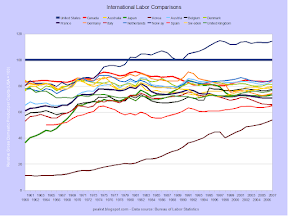
The first graph shows relative gross domestic product per capita, or per resident. The United States is the baseline, and is represented by the big straight line. The ratios for most industrialized countries stabilized in the early 1970s. The outliers are Norway, Korea, and to a lesser extent Spain. Norway is a small country which discovered a lot of oil in the 1970s. Korea by far was the poorest in 1960, and also has reduced the difference with the United States the most. Spain was the poorest European country shown and still is, though Italy has declined recently to nearly match it.

The ratio of GDP per worker is more significant because it shows the relative productivity of workers in each country. Again, the United States is the baseline, with Norway and Korea remaining outliers. These ratios stabilized somewhat later than the per capita measurement, in the early 1980s. The ratios then fell slightly in the late 1990s and the 2000s. My guess is that the widening reflects the two speculative bubbles in the United States, not real productivity increases by it's workers.
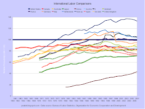
The employee to population ratio is important for overall wealth of a country, as more workers can obviously produce more goods and services. There seems to be three loose patterns: Japan and the Nordics have maintained a high level, France and the other Latins have maintained a lower level, and the Anglos have increased. A ceiling for the ratio may exist at slightly above 50 percent. Korea again is the outlier at the bottom.
The data for the next two graphs is less complete, but quite interesting nonetheless. It shows that most other industrialized countries have reduced the amount of time workers spend on the job, relative to the United States. Korea continues to be an outlier, though this time on the high side.
Americans have been working the same amount since the middle 1970s, but the downtrend continued in several other countries until as late as 2000. The Dutch and the Deutsche now work about 9 hours per week less than Americans, if the workyear is 50 weeks long. It usually isn't, as most European countries guarantee several weeks of paid vacation per year for all workers. The Koreans work a crazy 45 hours per week using a 50 week workyear.
Using the workweek and per worker GDP, relative productivity can be derived. Workers in several countries have surpassed Americans, though the gap narrowed during the past decade. Korea, once again, is an outlier on the undesirable side. Germany experience a large drop in productivity when data from the unproductive formerly communist economy of East Germany was merged with that of the larger western portion.
In this single year view of 1987, the bunching around the 80 percent line can be seen.
Moving to 1997 shows a relative gain by most countries. (Go to my Picasa page to see the changes better.)
2007 shows most countries falling back slightly. Again, I think the widening gap is due to America's bubblicious economy, not real productivity gains.
Going back to 1977 shows the long-term changes.
One factor may contribute to the appearance of higher productivity in America - the country produces less per unit of energy. Compared to other OECD countries, America has long had plentiful energy resources. The UK and Norway didn't start producing from their major oil fields until the l970s, and nobody matches America for coal deposits. This appearance of abundance (it's transitory) has led Americans to be less concerned about energy use, and a lot is wasted. However, the excess use shows up positively in the GDP numbers.
Someone once quipped (roughly) that Americans consume cars, while the French consume vacations. It's hard to dispute that most other OECD residents work less than Americans. And with slightly lower productivity, the result is most countries produce about 80% of US per capita GDP. The most notable outlier is Korea, where workers produce a lot less despite working considerably more hours per year. My sense is that Korea business are able to provide their workers with equipment that matches equipment in other countries, so I am at a loss to explain the significant difference. Norway is an outlier on the other end, but that is explained by the North Sea oil fields.
The choice of free time over stuff is a value judgment, of course. However, in most debates in this somewhat stupid country, the trade-off is forgotten and the focus is on the headline number: per capita GDP. But, as the saying goes, in the long run we're all dead, so I think time is more valuable - and I have arranged my life to reflect that.
A few side notes. First, all these numbers are based on purchasing-power parity (PPP) conversions, and thus are estimations. Calculating PPP requires some value judgments and thus gives different results from exchange conversions. Second, despite its prowess at manufacturing, Japan never "caught up" with the United States under PPP comparisons. The collapse of the property and stock bubble around 1990 is probably the main cause, but Japan has a number of structural problems that have lingered for even longer. Third, Italy has show a significant relative decline. It too has a number of structural problems - probably even more than Japan.


No comments:
Post a Comment