Wednesday, December 31, 2008

Only in Growth, Reform, and Change Is True Security To Be Found

The number of issues that need to be addressed has really piled up over the past 8 years - and the preceding 8 years weren't all that productive either.

My top three issues are:

  1. End the war in Iraq.
  2. Fix the economy.
  3. Implement a national single-payer health insurance system.

My un-prioritized (and growing) laundry list includes:

  • International relations
    1. End the war in Iraq.
    2. Finish the war in Afghanistan and withdraw.
    3. End the trade embargo of Cuba.
    4. Shrink our global stealth empire.
    5. Reduce our involvement in NATO.
    6. Stop funding Israel, Egypt, and Jordan.
    7. Stop allying with nasty regimes in Persian Gulf area.
    8. Increase aid to sub-Saharan Africa, Latin America, and the Caribbean.
    9. Make economic growth and good government in Mexico the number one foreign policy priority.
  • Crime and Justice
    1. Close Guantanamo and any other similar detention facility
    2. Repudiate torture permanently.
    3. End domestic spying programs.
    4. End non-judicial asset forfeiture.
    5. End the War on Drugs by decriminalizing marijuana and medicalizing other drugs.
    6. Expand use of incarceration alternatives for non-violent offenders.
    7. Get rid of mandatory minimums and "three-strikes" laws.
    8. Eliminate the death penalty for everything but treason.
  • Elections and government
    1. Amend the constitution to provide for direct presidential election and a January 1 inauguration.
    2. Amend the constitution to give the District of Columbia a Senator and remove the Veep from that chamber.
    3. Amend the constitution so that all federal officeholders are elected with at least 50% + 1 vote.
    4. Amend the constitution to limit federal legislators to a total of 18 years per chamber.
    5. Amend the constitution to limit Appeals and Supreme Court judges to one 20-year term, and District judges to one 30-year term.
    6. Tie federal officeholders pay to the minimum wage - 50x for president, 40x for the Veep and Supremes, 30x for Senators, and 20x for Representatives.
    7. Make election day a national holiday.
  • Agribusiness and agriculture
    1. End the ethanol scam.
    2. End the sugar/high fructose corn syrup subsidy.
    3. End subsidies to all large farms.
    4. Rebuild the food inspection system.
  • Workplace
    1. Crack down on the abuse of contractor rules.
    2. Expand overtime to front-line professional workers and reduce the number of exceptions.
    3. Require triple overtime rate for all employees after 56 hours with a rolling window except during declared emergencies.
    4. Require overtime rates be paid on national holidays.
    5. Require a minimum vacation accrual rate for all employees - at least 4 minutes per hour.
  • Immigration
    1. Step up enforcement of employment laws and increase penalties substantially.
    2. Implement or improve a seasonal agricultural worker visa program.
    3. Set up a limited "path to citizenship" program.
  • Environment
    1. Assess a motor fuels tax that constantly increases at rate of $0.02 per month.
    2. Implement a broad carbon tax that constantly increases.
    3. Step up efforts to control non-point water pollution sources.
  • Education
  • Defense and Intelligence
    1. Reorganize the intelligence agencies somehow (I'm still pondering the details).(
  • Economy (in addition to the separate list)
    1. Require the same amount of reporting of investment income to the I.R.S. as wage income is subject to.
  • Miscellaneous
    1. Do something about the travesty that is the Bureau of Indian Affairs.
    2. Do more to end the international human trafficking trade.
    3. Make all judicial positions appointments (state-level issue).

I don't hold any illusions about the passage of most of my agenda, but I will be disappointed if my top three items don't receive serious attention.

Sunday, December 28, 2008

There Is Safety In Reserve, But No Attraction

(Final draft, but I might update it if I learn more.)

A few posts back I asserted that the Fed would be "printing" now that the Federal Funds interest rate has hit the zero bound. It turns out that's not really true. This excellent post explains how the Fed works and what it has been doing lately. I'd like to be able to improve on the post, but it's too good. So, what follows is mostly a restatement in my own words, in order to clarify the situation in my own mind, with some pictures added to help me along.

First, we should back up a bit. For a number of reasons, most sovereign countries issue their own currency, which is "legal tender" with their borders. The Eurozone countries are exceptions to this practice, and various other countries - usually small or poor - have adopted foreign currencies as their own because local political leaders realize the local governments are hopeless. In better-governed countries the local governments have assigned the right to create money to a single, independent authority. Generically, this entity is called a central bank. In the Eurozone, this bank is a trans-national institution, which has pluses and minus. The Federal Reserve System is the most prominent example of this type of institution. A responsible central bank, like regular banks, keeps its balance sheet balanced. It also tries be predictable, if not entirely transparent. And to keep inflation in check, it has to be very careful about exercising it's power to create money.

(I apologize for the lousy color schemes on the graphs below. My software picks them by default and I haven't gotten around to changing the colors in this set - it's a very tedious process.)

Here we can see the Fed being predictable - until it isn't. The lines are very smooth and the slope doesn't really change until mid-September of 2008. That's when Lehman was allowed to fail and the credit markets blew up.

The left side of the Fed's balance sheet is where the alphabet soup of purchasing programs shows up. The explosion of liabilities on right side of the sheet seen above was initiated in order to hoover up bad assets from the credit markets and plop them on the left side.

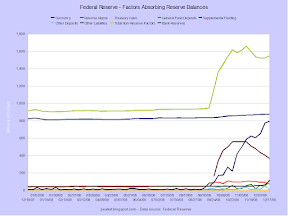
Zooming in on the past year and eliminating the total liabilities line highlights how completely unprecedented recent developments are.

The asset side of the balance sheet is operating in uncharted territory as well.

Here's a stacked view of liabilities.

And a stacked view of assets.

A composition breakdown of liabilities shows the rapid growth of non-currency items.

And finally, the breakdown of assets shows the rapid fall of Treasuries as the primary holding.

As you may have noticed, I have reversed the normal pattern of listing assets before liabilities. That's because the Fed really has been trying to acquire cash (liabilities) before it acquires stuff (assets). Which is to say that the Fed is NOT "printing" - at this point. All the money it is pumping into the economy by buying up assets (trading cash for stuff) is being drained on the other side by taking on liabilities (trading stuff for cash, or sucking in cash.) The balance has been perfect for the past 6 months to two decimal places - though there are small fudge factors deep in the numbers on both sides.

The other thing you may have noticed is that currency in circulation is considered a liability. It is, and it's a non-interest-bearing one. When the Fed adds cash to the economy, it buys an equal amount of stuff (assets). Looking at it the other way, the regional Federal Reserve branches have to buy cash, which they need because people want to conduct transactions. And they need more and more of it because in a growing economy people are conducting more or more valuable transactions every day. If the Fed gave away cash for free, the regional banks would request what they needed and a whole lot more, and cash would become worthless overnight. Instead, the Fed makes the regional branches cough up something of value, which they originally got from various commercial banks in return for the last round of cash. And on down the line. Thus the Fed acquires a pile of interest-bearing assets (somebody else's liabilities), and uses the income stream from the pile to fund its operations. The net of interest minus operating costs is sent to the Treasury.

But wait, you say, don't the Fed's assets consist mostly of Treasuries? (Pay attention here because it's going to get weird.) Yes, it does. And thus, when the Fed buys Treasuries, it takes most of the government's interest rate exposure out of the public's hands, with only the cost of the Fed's operations still flowing out into the economy. For all intents and purposes, the debt disappears because the Fed hands out non-interest-bearing debt in the form of cash when it gets the Treasuries. So what's the point of having the Federal Reserve if the Treasury is essentially paying itself for it's own debts? Well, we want the Fed to be independent in its operations, not be subjected to the immediate whims of politicians. A very extreme example of the results of non-independent monetary policy can be seen in Zimbabwe. The Fed, in contrast, is charged with maintaining stable prices (and full employment, but that is another discussion) and politicians have no easy way of changing that mandate. This makes it unlikely that the institution will print gobs of money to pay off the federal government's debt. And as bad as the federal government's balance sheet is, hyperinflation is a lot worse.

Theoretically, the Fed could sell off all of it's Treasuries and try to suck back all the dollars it has sent out over the years. In the past it has done this occasionally on a very small scale when it thinks the money supply is growing too fast. But lately it has been doing something else. It has been selling Treasuries for cash, but then immediately shipping the cash back out for a different set of interest-bearing assets. The specifics of these new assets are largely unknown, but the charts above show the broad classes. It also has acquired cash from two new sources. One is the Treasury, which sold off a pile of brand new Treasuries specifically for the purpose of putting the money in its checking account at the Fed. The Fed used this cash to buy new assets as well. Finally, commercial banks have put a huge amount of "excess" reserves into their accounts at the Fed (at the regional branches, to be precise). Once again the Fed has been using the new cash to buy assets.

So what's the problem if everything balances out? It turns out there are three problems. First, it re-exposes the federal government to principle and interest liabilities that were once hidden in the Fed. With the public now owning the Treasuries that once were at the Fed, the interest payments no longer magically reappear in the pocket they just came out of. Since these Treasuries are mostly short-term issues, there is also the danger of not being able to roll them all over. Second, the Fed is paying interest on the excess reserves. A note on these reserves. The reason the banks have all this extra dough is they aren't lending. Remember the credit crisis? Here is proof that is quite real. The Fed has basically said: okay, since you guys won't lend, I'll borrow your cash and lend in specific credit markets that you pansies are too chicken to enter, and I'll make sure you lend me the extras by paying interest on what you deposit. Normally banks only have between $5B and $30B of reserves at the Fed. Now it's around $800B, and the annual interest on that will be at least $2B. While that amount is a lot less than the $15B the Fed is on track (or was, as of Dec 1) to return the the Treasury this fiscal year, but it's still a lot of money. Which brings us to the final problem.

The third problem is only a potential one at this point. As I said above, we don't know exactly what the Fed has hoovered up, so we don't know if the assets will perform, meaning provide a stream of payments of interest and, possibly, principal. The Fed might have bought junk at a discount. The Fed might have bought junk at face value. The Fed might have been choosy and selected only the best assets. The Fed might have driven a hard bargin and bought great assets at fire-sale prices. We don't know. If the assets perform poorly, the Fed will have a hard time meeting its interest obligations. If they blow up, perhaps because the issuer goes bankrupt, the Fed will have a real problem. The interest and principle would disappear, but the corresponding liability would still exist. But since the Fed is, you know, the Fed, it can't short any of its creditors. Fortunately, about one-third of the new liabilities are deposits by the Treasury, and it's highly unlikely the new assets would decline in value so much that new borrowing by the Treasury would be needed. Any gap between the assets sold and the liabilities paid off would just end up as another liability of the American taxpayer.

So, by looking at both sides of the Fed's balance sheet, it seems pretty clear that the Fed is not doing Zimbabwe-style printing. All the "innovations" are being "sterilized", meaning there is no new currency being issued. Right?

Well, maybe not. The M0 (currency) line shows a definite uptick for that measure. M1 (M0 plus checking accounts) is definitely way up. But M2 (M1 plus savings accounts, small time deposits, and money market deposit accounts) growth isn't as high, and while the MZM (M2 minus time deposits plus all other money market accounts) was high earlier in the year, it's growth has come down.

A broader time frame provides some needed context. M1 growth is still notable, but the other measures are growing less fast than they have at various times in the past.

Zooming out the the full extent of the data shows some freaky action in the MZM measure during the early 1980s.

So why is M0 up? Because the Fed hasn't stopped issue currency, and is actually doing so a little faster than before September. Over the time period for which I have both sets of data, the two measures track identically. That's expected. In light of this, inspecting the first and third graphs does reveal a slight upward movement of the currency lines near the end of the time frame. But the last graph shows that the M0 growth rate is not unusual - so far.

Frankly, I think it's too soon to decide if there is a new trend in the money supply. And I also think that it is possible that some of the growth is from people switching their preferences for financial assets towards what they perceive as safer instruments, such as bank deposits and physical cash. The economy is certainly not growing, but yet the demand is still there. So out the door the dollars go. Whether the Fed sucks extra dollars back in when the economy starts to grow or lets them float about and create some inflation remains to be seen.

Tuesday, December 23, 2008

Be Not Made a Beggar by Banqueting on Borrowing

Apropos of the last post, here's a scatter plot of trade deficit and public debt.

No real pattern, but some of the groupings are interesting. And there are a lot of countries bunched together, centered around about -4% of GDP on trade and 45% of GDP on public debt. The US is slightly up and to the left. I'll have to do one without so many minor countries countries.

Update: Removing some countries helped a bit. Japan is the most notable of the missing, but it was so far above the others that removing it really opened up the vertical spacing.

Monday, December 22, 2008

Ever Since, I Have Distrusted Myself and Avoided All Predictions

Everybody is doing it, so why not join in. Not sure if I can think of ten off the top of my head.
  1. The recession will last until 2010Q3. Nominal GDP growth will become positive in 2009Q4, but by NEBR scoring the downturn will last a lot longer.
  2. Unemployment will hit 10% in 2009Q3. The job market will be brutal in 2009, and robust job growth won't start until 2011. And 10% is the U3 number; U6 will reach 16%.
  3. Oil will fall to $25-30.. After bottoming in that range crude will rise substantially as the dollar weakens in the second half of the year. Against the euro and other currencies the change won't be as great. But the price in any currency will be low enough to seriously damage the petro-states.
  4. The dollar will lose strength. The dollar will stay flat for the first half of the year as money continues to flee emerging markets, then fall to 80¥ and 0.55€ as people start realizing that the Fed is printing. The greenback could go to 0.45£, or to 0.80£ depending on how bad things get in "The City".
  5. A country will leave the Euro. I've been predicting Italy will leave for some time now; this may be the year I'm finally right. The dark horses for the dubious distinction are Spain, Greece, and Ireland
  6. China will blow a gasket. The current leadership seems unprepared for the current crisis, and has spent too much money propping up state industries instead of investing in desperately needed basic infrastructure inland. The pain will be widespread even if the renminbi is devalued. There is a good chance the devaluation will be excessive and prompt a reaction from the US.
  7. The mercantilists will crash. Both Japan and Germany failed to address structural problems while times were good, depending instead on a positive balance of trade to paper over the problems. The decline of trade in general, and with the US specifically, will cause these problems to re-assert themselves. Other significant European exporters - Norway, Finland, Sweden, Netherlands, Switzerland, and Austria - will suffer as European importing countries - Spain, United Kingdom, Italy, Greece, Portugal, most of Eastern Europe - find their public and private budgets severely pinched. However, the pain won't be as great as that of the big exporters because of better fundamentals. The smaller East Asian exporters - Thailand, Indonesia, Malaysia, Singapore, Hong Kong, Taiwan, and Korea - will suffer as is usual during a US downturn.

    That's all for now.

    Update: This list goes to 11.

  8. GM and Chrysler will both file for bankruptcy. GM will seek Chapter 11 protection in March, and will re-emerge in a few quarters. Chrysler will file at the same time, and then be dumped on the UAW and various creditors by Cerberus. However, the company will be too far gone to save, and liquidation will start in early 2010.
  9. The banking system will evade nationalization. Between Obama's deep-seated cautiousness and the wall-to-wall appointment of economic insiders, the banking system will not be subjected to the "Swedish model". The Fed will continue to be the primary source of relief, and its balance sheet will expand by another $2T.
  10. Retail and commercial real estate will get crushed. CRE is wildly over-built and over-leveraged after years of cheap credit. Personal consumption will fall almost 8% from 2007 levels, and thus many store chains will file for CH7, leading to massive loan defaults by property holding companies.
  11. Housing will decline for the entire year. Aggregate prices will continue to fall until 2010Q2, though as usual local markets will vary widely. Homebuilders will finally go bankrupt due to continuing declines of spec starts after unexpectedly clinging to life in 2008. Sales volumes of existing housing will decline through 2009Q2 then flatten for the rest of the year.

Well, that's what I've got at the macro level. Predicting the markets is not one of my talents, so I'll forgo the embarrassment on that front.

Saturday, December 20, 2008

The Best Way Out Is Always Through

Easy to say if you make it through. That's still in doubt for the Detroit 3 unless sales pick up. My guess is sales will be 10-11 million in 2009 and 11-12 million in 2010. That won't be enough to keep Chrysler going, or Ford and GM profitable. Update: Or Toyota.

Sadly, Saab sales continue to tank despite making good cars. Happily, Hummer sales continue to tank, to the relief of eyeballs across the nation. MINI had the biggest gains over the past year, but sales of the single-model brand are still miniscule (heh).

Chrysler is the worst performing group, though Nissan isn't that far behind. Ford, Honda, and Toyota had nearly identical declines in November 2008.

Friday, December 19, 2008

Finally I'm Becoming Stupider No More

At last, a (choose one of: plan|bailout|rescue|giveaway) for the American auto industry emerges. It's just a bridge to March 31, but at least the problem was punted into the Obama administration, instead of being allowed to snowball into "disorganized" bankruptcies and possible destruction of the sector.

Just to review, sales across the globe are plummeting. Canada, Spain, and Sweden have announced plans, while France, Britain, and Germany are considering plans. Japan will continue providing aid via currency intervention.

Why so many Americans insist the country be a free-trader in a world of mercantilists continues to baffle me, especially since the results are not good for the country.

Wednesday, December 17, 2008

Lump of Lines

I ran across the "lump of labor" fallacy again the other day, and it got me thinking about international comparisons of work-life tradeoffs. So I tracked down some data and made some graphs. And without further ado, here is my latest set of squiggles.

The first graph shows relative gross domestic product per capita, or per resident. The United States is the baseline, and is represented by the big straight line. The ratios for most industrialized countries stabilized in the early 1970s. The outliers are Norway, Korea, and to a lesser extent Spain. Norway is a small country which discovered a lot of oil in the 1970s. Korea by far was the poorest in 1960, and also has reduced the difference with the United States the most. Spain was the poorest European country shown and still is, though Italy has declined recently to nearly match it.

The ratio of GDP per worker is more significant because it shows the relative productivity of workers in each country. Again, the United States is the baseline, with Norway and Korea remaining outliers. These ratios stabilized somewhat later than the per capita measurement, in the early 1980s. The ratios then fell slightly in the late 1990s and the 2000s. My guess is that the widening reflects the two speculative bubbles in the United States, not real productivity increases by it's workers.
The employee to population ratio is important for overall wealth of a country, as more workers can obviously produce more goods and services. There seems to be three loose patterns: Japan and the Nordics have maintained a high level, France and the other Latins have maintained a lower level, and the Anglos have increased. A ceiling for the ratio may exist at slightly above 50 percent. Korea again is the outlier at the bottom.
The data for the next two graphs is less complete, but quite interesting nonetheless. It shows that most other industrialized countries have reduced the amount of time workers spend on the job, relative to the United States. Korea continues to be an outlier, though this time on the high side.
Americans have been working the same amount since the middle 1970s, but the downtrend continued in several other countries until as late as 2000. The Dutch and the Deutsche now work about 9 hours per week less than Americans, if the workyear is 50 weeks long. It usually isn't, as most European countries guarantee several weeks of paid vacation per year for all workers. The Koreans work a crazy 45 hours per week using a 50 week workyear.
Using the workweek and per worker GDP, relative productivity can be derived. Workers in several countries have surpassed Americans, though the gap narrowed during the past decade. Korea, once again, is an outlier on the undesirable side. Germany experience a large drop in productivity when data from the unproductive formerly communist economy of East Germany was merged with that of the larger western portion.
In this single year view of 1987, the bunching around the 80 percent line can be seen.
Moving to 1997 shows a relative gain by most countries. (Go to my Picasa page to see the changes better.)
2007 shows most countries falling back slightly. Again, I think the widening gap is due to America's bubblicious economy, not real productivity gains.
Going back to 1977 shows the long-term changes.
One factor may contribute to the appearance of higher productivity in America - the country produces less per unit of energy. Compared to other OECD countries, America has long had plentiful energy resources. The UK and Norway didn't start producing from their major oil fields until the l970s, and nobody matches America for coal deposits. This appearance of abundance (it's transitory) has led Americans to be less concerned about energy use, and a lot is wasted. However, the excess use shows up positively in the GDP numbers.

Someone once quipped (roughly) that Americans consume cars, while the French consume vacations. It's hard to dispute that most other OECD residents work less than Americans. And with slightly lower productivity, the result is most countries produce about 80% of US per capita GDP. The most notable outlier is Korea, where workers produce a lot less despite working considerably more hours per year. My sense is that Korea business are able to provide their workers with equipment that matches equipment in other countries, so I am at a loss to explain the significant difference. Norway is an outlier on the other end, but that is explained by the North Sea oil fields.

The choice of free time over stuff is a value judgment, of course. However, in most debates in this somewhat stupid country, the trade-off is forgotten and the focus is on the headline number: per capita GDP. But, as the saying goes, in the long run we're all dead, so I think time is more valuable - and I have arranged my life to reflect that.

A few side notes. First, all these numbers are based on purchasing-power parity (PPP) conversions, and thus are estimations. Calculating PPP requires some value judgments and thus gives different results from exchange conversions. Second, despite its prowess at manufacturing, Japan never "caught up" with the United States under PPP comparisons. The collapse of the property and stock bubble around 1990 is probably the main cause, but Japan has a number of structural problems that have lingered for even longer. Third, Italy has show a significant relative decline. It too has a number of structural problems - probably even more than Japan.

Tuesday, December 16, 2008

Big Fat Zero

Update: I was wrong on the printing issue.

The Federal Reserve cut the target for the Federal Funds Rate to 0.00-0.25%. Effectively, zero. But, effectively, it was already zero. With core CPI hovering around zero, real interest rates are also about zero. And all these zeros add up to a big fat zero because where the economy is right now, real interest rates should be negative. But rates can't go below zero, so the Fed is "out of ammo" as the saying goes.

Quantitative easing is now the name of the game. Quantitative easing, you say? Printing. P-r-i-n-t-i-n-g. The goal is to prevent deflation which, as I said before, the Fed will do at (almost) any cost.

Side note: What about the money market mutual fund issue? Conventional wisdom was that rates below 1% would blow up most funds. I haven't heard anything on that topic recently.

Updated aside: Calculated Risk asks the same question.

Friday, December 12, 2008

Detroit Disaster Decision

In what has a good chance of going down as the worst strategic decision since the 2003 invasion of Iraq, Republicans last night voted against the Detroit bailout bill over the issue of forcing the UAW to make wage concessions before other stakeholders such as shareholders, bondholders, suppliers, and dealers.

That's right: before.

As the party of management and the wealthy, Republicans have long fought unions. This time, however, their union-busting efforts are about to become economy-busting efforts. On top of being stupid, what makes their move outrageous is that labor for final assembly amounts to about 10% of the price of a vehicle. And what makes their move even more outrageous is that the party of free enterprise is insisting on micromanaging blue-collar worker pay without micromanaging white collar pay (though it must be said Democrats efforts to control executive perks has gone overboard).

And the average water-carrying management tool in the comments at economy-focused blogs thinks that the Democrats are going to take the blame for this. Instead, the Republicans have just conceded every major race in the upper Midwest for a generation.

Update: Bush to the rescue! (I can't believe I said that.)

Looks like the Bush administration is going to authorize a loan using TARP funds - which the Democrats had been pushing for all along.

Update: Never underestimate the kabuki factor.

Thursday, December 11, 2008

The Post-Credit Economy - Looking Forwards

(very partial draft)

So, now that America, collectively and individually, has piled up debt to unsustainable levels, where do we go? Better answers might be found elsewhere, but here's my take nonetheless:

We need to admit we're poor.

Not Bangladesh-style desperately poor, but at the very least a good bit poorer than we were in, say... 2000. Okay, bad year to pick. How about 1997? That's before the dot.com boom really took off, and the year housing prices started to ramp up - both of which were in part caused by the passage of a package of capital gains taxes that year. Or maybe 2004 - stocks were at a reasonable level and housing prices weren't melting up yet? And there is the possibility that I am completely wrong.

So how can we figure out how rich or poor we are? One way would be to construct an economy-wide balance sheet and compute the net of assets and liabilities. There is a big problem with that approach - a lot of assets are mis-priced at this time. Real estate, stocks, bonds, autos, plant, equipment - who knows what they are worth, or will be. Between housing and stocks, about $14 billion in assets have gone up in smoke over the past year or so. But we'll look at the results of that approach anyway. The other way to is look at economy-wide cashflows to see how much is obligated and how much can be freely spent or saved. This approach has problems also, in that a lot of debts are about to be defaulted on, which will alter cashflow significantly. But money will still change hands for all kinds of reasons, so it might be a better approach.

Fortunately, the gnomes at the Fed (just kidding - they are perfectly fine people aside from Greenspan) have done a lot of the hard work already. The quarterly Flow of Funds report captures all kinds of interesting data. Well, interesting if you are interested in uninteresting kinds of things.

This graph of the household and non-profit sectors doesn't look so bad at first glance (unfortunately the two sectors are lumped together in the report). Liabilities are up, assets are up more, and thus net worth is up. The only worrying aspect is that the ratio of assets to liabilities has declined substantially.

This graph shows several interesting - but not particularly surprising - things. First, net worth tracks changes in assets closely. Second, both assets and liabilities track changes in GDP, but exhibit greater swings. Third, the mean increase in liabilities is well above that of assets.

Zooming in on the past 15 years highlights both the dot.com bubble of 1997-2000 and the housing bubble of 2003-2007.

Here are the changes for the same time period.

This graph better highlights the dot.com blowup and the new downturn that is developing - and that will probably keep going for a while. (I'm not sure if this way of presenting the data is good but I'm keeping the graph here for now.)

This graph shows how first equities then real estate expanded as a proportion of household and non-profit wealth. The other asset classes have remained mostly constant, but should grow in proportion in the next few years as both stocks and real estate are set to decline.

Here are the annual changes for the same asset classes.

Assets again, this time verses nominal GDP change. (I'm not sure if this way of presenting the data is good but I'm keeping the graph here for now.)

Liabilities appear less diverse because several types of borrowing - credit cards, auto loans, and some others - are jammed into the consumer loan category. The other category consists mostly of several types of non-profit liabilities - a few other household liabilities are in there too. Residential mortgages dominate.

The mortgage debt buildup during the housing bubble is really noticeable here. There was also a smaller buildup of consumer debt back during the dot.com bubble - that might have been either wealth-effect borrowing (borrowing in light of high stock values) or margin borrowing to invest in stocks.

Here is liability growth compared to GDP growth. (I'm not sure if this way of presenting the data is good but I'm keeping the graph here for now.)

So after looking at all those squiggly lines, what have we learned? First, both assets and net worth are currently significantly higher than their long-term averages. We know the dot.com uptick was illusory, and there is every reason to think the same about the housing bubble. In fact, the drop-off can be seen already. Second, despite the upturns in assets and net worth, the ratio of assets to liabilities has come way down. Now, a lot of the long-term decline was probably due to reasonable expansion of credit for previously under-served minority communities. But the flatline from 2002, when the stock market was at a low point, to 2007, when both the stock market and the housing market turned down, is worrisome. People were adding debt at nearly the same rate as their assets were increasing during an expansion. And growth wasn't even very strong.

Monday, December 8, 2008

Rebalancing

(partial draft)

There seems to have been a bit of blogburst over the past few weeks on the implications of collapsing consumer demand and potential inflation in America on the international trade system as it currently operates. There is always some background chatter on the trade deficit, but it seems to have become louder, perhaps prompted by China's apparent desire to depress the renminbi against the dollar in order to keep it's faltering export-led economy as juiced as possible.

The trade deficit is an old hobby-horse of mine, one that I don't ride much because with the dot.com boom and the real estate bubble keeping money (or debt) flowing freely, most people didn't give a damn. Cheap crap for everybody - hurray! But the imbalance has been steadily growing for years, blowing past big, leaving huge in the dust, and reaching colossal proportions without undue effort. And with the rest of the economy in the crapper, a lot more of people are finally realizing that we have a problem.

Concerns about outsourcing and imports are nothing new. For instance, in the 1980s there was a lot of hand-wringing about Japan overtaking America. The concern was overblown, but became a entrenched media narrative because the Japanese were growing market share for a product of particular sensitivity for Americans - the automobile. The shift in purchasing was mostly a home-made problem, but the 1979 oil embargo and a ridiculously strong dollar pushed sales of imports to an even higher rate of increase than they had been in the 1970s. But by late in the decade, with a more reasonably valued dollar, somewhat better leadership in Detroit, and the virtual withdrawal of several European makers, concern faded. The 1990-1991 recession brought overall trade almost back into balance, but then something important happened: China took off.

The phenomenal growth of trade with China was something of a surprise, since much had been made of NAFTA and that "giant sucking sound" from the south early in the decade. True, a lot of manufacturing did end up moving to places like Juarez or Tijuana, where the maquiladores set up shop. European and Japanese companies also set up final assembly plants so as to be inside the NAFTA tariff zone. But unlike East Asian countries, Mexico showed little ability to move up the food chain. It merely provided labor, and as a result it's economy grew much more slowly than places like Korea or Taiwan.

Like Dean Baker, I have long though the Clinton-era strong dollar policy was moronic. The dollar should have been left to find it's own level, or at least not further strengthened with the implicit threat to intervene in currency markets behind pronouncements by government officials on the topic. However, at first glance this somewhat confusing chart (basically, the higher the line the strong the dollar is against that currency, meaning the same dollar can buy more widgets or wine in the foreign currency) doesn't show a radical strengthening. The dollar actually weakened from 1993 to 1995 before returning to the previous level in 1997. But that is unexpected because the US trade deficit was increasing rapidly at the time. Significant trade deficits should have driven the dollar down because the foreign exchange market works like any other commodity market. People with more dollars than they need (exporting countries) are willing to sell them at every lower prices for what they do need, which is local currency. That's the theory, at least.

But a closer look at the exchange rate graph shows something odd: a perfectly flat exchange rate with China from 1994 until 2004. Unlike other currencies, the renminbi was fixed against the dollar and in 1994 the Chinese significantly devalued it. And on the previous graph the results can be seen: a rapidly increasing trade deficit with China. Trade with other countries stayed roughly flat, at least until 1998. The Asian financial crisis of 1997 made investors flee many emerging market countries to the safe haven of the dollar, thus pushing its value way up. Then trade took off with everyone. So, in the end, I think the strong dollar policy made only a small difference. It was allowing China to fix the renminbi at such a low level that did the most harm.

Whatever the reason, an overvalued currency was good for lots of constituencies in the short term. It became even easier for American businesses to outsource because their investment dollars went farther. It was easier for developing countries to attract capital to expand their economies - and export sectors were the focus of many governments' policies. It allowed advanced exporting countries to continue ignoring their own structural problems. It made consumer goods cheaper for Americans, along with petroleum products, keeping inflation down. It feed the dot.com boom because the deployment of technology became cheaper as overseas manufacturing learned to make ever more sophisticated products. And it put American investment bankers in charge of a huge portion of the world's capital flows. In other words, globalization happened.

Sounds great, eh?

And it was - for everyone not employed in the American manufacturing sector. As the decade wore on, a whole narrative developed that said the decline of domestic manufacturing was okay, even good. Americans, instead of making stuff, would become "knowledge workers", sending ideas and services around the globe. But that didn't work out as well as planned. The balance on services expanded slowly and the balance on income remained low relative to GDP, but imports of goods exploded.

Front-line production workers got hit the hardest, of course. Even after factoring lower productivity, longer delivery times, and the friction resulting from communication over distance, time and cultural misunderstandings, outsourcing low-skilled jobs to East Asia was cost effective. A wage differential of 20 times or more is hard to overcome, no matter how well American workers are trained and equipped. And once it got rolling, nothing seemed to stop it. That's because the world, and especially China, extend to the US the "mother of all vendor financing deals" for most of the next decade.

The loss of low-value-added jobs making textiles, footwear, and the like shouldn't be mourned all that much. America has been bleeding those jobs for decades anyway. But the total unwillingness to manage the decline of older industries has made the process far more painful than needed. In the past, various tariffs or other barriers were sometimes implemented to protect domestic jobs. The efforts never worked all that well, and by the 1990s that approach had fallen out of favor - except during the 2-3 months before each election. Instead, the government should have weighed in with policies designed to consolidate the industry at hand in an orderly fashion, remove "legacy" costs as much as possible from the survivors, and help regions that were overly-dependent on one industry to attract new jobs before the older industry collapsed. In other words, America should have had some kind of industrial policy - at least for declining industries. Unfortunately, the dominant free-market ideology prevented the development of high-level policy

The lack of a national healthcare system made the decline of older industries more likely, as recent news in the auto industry demonstrates. Not only are costs for existing workers higher than in other countries, past promises to provide healthcare for retirees became a significant overhead cost. The steel industry also suffered tremendously due to legacy costs, though in that case pensions were the main burden.

Trends in international trade have not been entirely negative. America continues to be a net exporter of aircraft, locomotives, and parts for each. Balances of trade for industrial products have remained about the same after declining from an artificial high in the late 1970s. The net effect on the economy from the sector is small despite the volumes of trade being quite high.

Friday, December 5, 2008

Nationalization Now!

My considered, but possibly unconstitutional, not to mention probably unworkable, proposal to fix the banking system:

  1. Stop trading of all bank stocks.
  2. Declare all deposits and all debt issued by banks to be government guaranteed for the next 5 years.
  3. Require all banks to write down all mortgages issued after 2000 by a formula determined by zip code, valuing the home at the same variance from the 2007 median but relative to the 1997 median extrapolated by CPI+1%.
  4. Buy all underwater or non-performing mortgages at the new values off the books.
  5. Offer to buy MBSs and similar toxic waste from all non-banks at the same write-down level.
  6. Work through the books of all banks to see which are still solvent starting at the bottom of the size scale.
  7. Let trading resume on solvent banks.
  8. Nationalize insolvent banks (public or private), wipe shareholders, clip bondholders, and revoke warrants.
  9. Recapitalize insolvent banks and set up a schedule for selling them off.
  10. Work through bad mortgages, offering a) principle write-downs with a shared appreciation clause to people who were more-or-less responsible and are relatively solvent, and b) one-step non-judicial bankruptcy with repossession, a non-pursuit agreement, and a rent-back offer to the irresponsible and/or hopelessly insolvent. Fraud by any borrower should be pursed.
  11. Set up a schedule to sell off government-owned properties.

This plan focuses on residential mortgages. Of the other four big distressed classes, CRE mortgages can be treated in similar manner with more case-by-case decisions. LBO loans are often made by highly speculative players, so the government should take on those loans only if it is providing DIP (debtor-in-possession) financing as well. The total amount of consumer credit (primarily credit cards) and auto loans outstanding is much less, as well as being too fine-grained to be worth working through, so borrowers and/or creditors will to have to deal with those on their own.

Obviously, this proposal screams "MORAL HAZARD" at an ear-shattering volume. But we are way, way, way beyond the point of being able to limit the harm to those who were "irresponsible." The money is gone. *Poof* Time has come to accept that and get the banks back to a point where they can (and will) loan again. On the plus side, it does mete out a bunch of harm to shareholders who let lending get out of hand.

The unworkable aspect of this plan is assembling sheer number of appropriately qualified workers that would be needed. There are a lot of newly unemployed financial services workers floating about. But locating them, leasing enough workspace, equipping them with computers, providing instructions, and setting them to work would be a huge and time-consuming task. The workers at the ratings agencies, the latter having proved themselves to be completely useless, could (should) be dragooned in place to provide a jump start. But the task would still remain daunting, to say the least.

November Jobs in Freefall

The numbers were awful:

  • 533K lost in November (initial estimate)
  • 403K lost in October revised from 240K
  • 320K lost in September revised from 284K
  • Total YoY loss of 1,870K

Time to nationalize the banks. There are too many holes to plug.

Update: Chart Pr0n!

Here are the raw numbers for population, civilian non-institutional population (adult non-convicts and non-military), labor force (everybody who wants to work according the BLS's questionable standards), employment (people who are working in some manner), manufacturing payroll, and government employees (federal, state, and local civilian workers). The numbers run from January 1952 to November 2008.

The non-institutional population has gone up over the past half century due to the "Boomers" growing up...err, getting older. The labor force has expanded due to the "Boomers" and to women entering the workplace. Government employment has grown as well, but not as much as manufacturing has declined. The rest of the employed are part of the glorious "service economy", parts of which have been dedicated to impoverishing the nation for the past 10 years. The slim bit of yellow are people who have been liberated from their jobs.

Zooming in on employment doesn't reveal much more. A non-zero based graph right here would be more dramatic, but misleading.

Graphing the percentage changes of employment and workforce shows an interesting correlation between the two. The unemployment rate line shows that job recovery has become less rapid, perhaps due to the decline of large manufacturing plants, or to better inventory management. Note that the unemployment rate equivalent to the "U3" number from the BLS.

The correlation is much clearer when the timeframe is narrowed. I'm going to march boldly out onto a limb and state there is a causal relationship from job growth to workforce growth. The BLS gets accused of fudging the U3 number it publishes because the highly variable workforce number makes the U3 look better.

Over the long term, the ratio of workers to non-workers is very important. It's gone up until recently.