Friday, August 5, 2011
How's That Working For You: July 2011 Edition
Here's the latest in another chart series that I abandoned for a while.
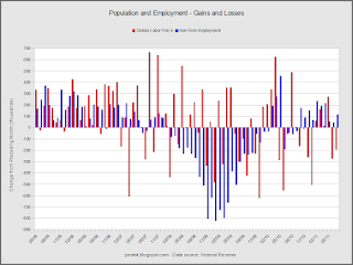
The recession is pretty obvious here.
I think the data speaks for itself.
And here.
The unemployment rate is staying high instead of declining from a peak as it did in 1981.
Next are zoomed versions of the previous two graphs
Population growth has slipped below 1%.
The labor force data has become very noisy since the beginning of the pre-recession in early 2007. That's when people started experiencing that Wile E. Coyote moment and growth slowed.


No comments:
Post a Comment